
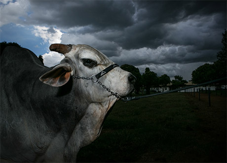
IMAGE: Jabriel, a “luxury bull,” whose semen is the most valuable in the billion-dollar Brazilian cattle genetics industry. Photo from the “Holy Cow” series by photo-journalist Carolina Arantes.
Jabriel is what can be described as a “luxury bull”–his genes so perfect that he lives protected in the farm of a lab in the south-eastern state of Minas Gerais.
Via The Guardian, I was introduced to Jabriel, whose value was assessed at $800,000 in 2016. Jabriel is the star of the Brazilian bull semen market, and thus of photo-journalist Carolina Arantes’ series “Holy Cow,” which documents this little-known but lucrative industry. (“Holy” is, in part, a reference to Jabriel’s ancestral lineage: in the nineteenth century, specimens of India’s distinctive and sacred zebu cattle were brought to Brazil. Their genes are responsible for much of Jabriel’s value today.)
Jabriel is an A.I. bull, in the terminology of an industry where those initials stand for artificial insemination, rather than intelligence. He is rated “Concept Plus,” which, again, does not refer to a particularly advanced idea, but instead to his fertility: his owners, Alta Genetics, promise that their “high fertility CONCEPT PLUS sires will give you a 2%-5% conception rate advantage over the average sire.”
Jabriel’s charms do not stop there. With the help of Google Translate, I’m further able to appreciate him as a “Very racially beautiful reproducer, which transmits to its children fast gain in weight and excellent refrigeration conformation.” (Reprodutor de muita beleza racial, que transmite aos seus filhos rápido ganho em peso e excelente conformação frigorífica, in the original Portuguese.) Racial beauty and fast gain in weight seem self-explanatory (!) but excellent refrigeration conformation requires a little more interrogation: I think, based on my ongoing explorations of the artificial cryosphere, that it may refer to the known tendency of zebu beef to toughen during rapid post-mortem chilling, and/or the ways in which different assemblages of muscle fibre and fat respond to the refrigerator’s tenderization

Behold! Edible Geography rises, vampire*-like, from the dead, for today marks the publication of my very first book! Until Proven Safe: The History and Future of Quarantine is co-authored with Geoff Manaugh, whom long-time readers of this blog will recognize as my husband and frequent collaborator, as well as the author of BLDGBLOG and, more recently, A Burglar’s Guide to the City, among many other books, articles, and stories.
This book has been a very long time in the making. A very, very long time, if you consider that I have dreamt of having my name on a book cover since I was a kid devouring Charles Dickens, George Eliot, Agatha Christie, and anything else I could get my hands on, Jilly Cooper and Erich von Däniken included, by torchlight under my duvet. Some of you may also recall that Geoff and I led a workshop and curated an exhibition called “Landscapes of Quarantine” at Storefront for Art & Architecture in NYC, back in the impossibly distant autumn of 2009.
But that wasn’t enough to get quarantine out of our system, and we subsequently decided to write a book on the topic. Today, finally, spurred on only slightly by the arrival of a global pandemic and its accompanying mass lockdowns, that book is out in the world, and available for purchase!
Quarantine is, as we all now know, and as the host of our U.S. book launch event, Mary Roach, has astutely joked, extremely boring to live through—but it was utterly fascinating to spend a decade researching and writing about, and is, at least according to Mary, very enjoyable to read about too.
Edible Geographers will probably want to dive straight into our chapter looking at quarantine across species: the social distancing practices of ants and termites, as well as the border checkpoints, maximum security greenhouses, and agricultural robots that keep our food supply safe. You can hear me and Geoff discuss parts of that with my co-host, Cynthia Graber, on this episode of our podcast, Gastropod, and read an excerpt from that chapter of the book at Wired.
There’s much more in the book besides: the behind-the-scenes story of how U.S. quarantine efforts went so wrong during COVID-19; not to mention an Ebola bubble, some nuclear waste, a boredom researcher, a four-star general, and Johnny Depp’s dogs… One excerpt, in The Atlantic, introduces a group of obscure hobbyists who collect disinfected mail, and what their archives reveal about how quarantine has shaped borders, inspired the invention of the passport, and even led to the creation of the United Nations; another, in The Guardian, profiles the woman charged with protecting space from Earth life—and vice versa.
A seemingly simple concept—the temporary isolation of potentially dangerous life or matter, until it is proven safe—turns out to illuminate fundamental anxieties: about how to balance the risks of contact with outsiders with its rewards, for example, or how to navigate the bias and potential abuse inherent to a legal power of detention that is entirely based on suspicion. Quarantine offers the illusory attraction of drawing a line between inside and out—us and them—while highlighting the tension between individual liberty and public good, and even the eternal challenge of clear communication in a state of uncertainty.
All of which is to say, I am extremely proud of the book, and very happy to see it out in the world. Please pick up a copy, and join us at one of our book events in the coming weeks—if you’d like, with a Lazaretto** in hand!
*Vampire myths, as it happens, have a connection to quarantine: one of the longest-standing quarantine lines in history, on the edges of the Austro-Hungarian empire, became ground-zero for vampire sightings in the late 1800s, triggering a literary mania that swept Europe. Read the book for more!
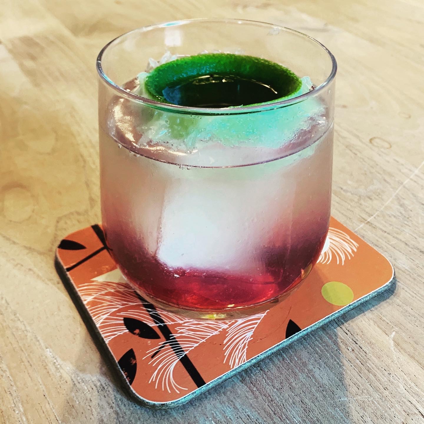
**The Lazaretto is a custom cocktail created specially for Until Proven Safe by master-mixologist Eben Klemm. It uses Wilder gin from Ventura Spirits: this is the beverage to which we turned after a hard day at the computer face while writing the book, and so we were delighted when they agreed to sponsor our book launch. Thank you, Ventura Spirits (and Rosecrans Baldwin, for the introduction)! And a huge thanks to Eben Klemm, for creating a drink whose resonances with quarantine work both conceptually and on the level of individual ingredients—but is still simple to make and utterly delicious! (Thanks also to Wayne Chambliss, for the introduction to Eben.) Grab some limes and make your own to sip while at our book events or while reading a copy of Until Proven Safe.
The Lazarretto
Combine:
2 ounces Wilder gin
Juice of 1/2 lime (use fresh limes; see below)
1/2 ounce honey syrup (dilute 1 part honey to 1 part water)
You may build the above ingredients in a small ice-filled Collins glass or shake with ice first and then strain into an ice-filled Collins glass. (Or, honestly, whatever glassware you have)
Fill to 1/4 inch from top with good quality tonic water.
Turn lime half completely inside out and poke a hole in its navel with a skewer. Place in drink, convex side down, and add 1/4 ounce cassis inside of the “lime-aretto.”
The lime-lazaretto is, like all quarantines, inevitably leaky. The blackcurrant is a fruit that was under federal quarantine for years—it acts as a host for a pathogen that wipes out pine forests (this quarantine is the reason that purple Skittles are grape-flavored in the US and blackcurrant everywhere else). The citrus and honey refer to the California border quarantine system, which protects the state’s unique ecosystem (as embodied in the native botanicals in the gin), as well as its agricultural economy. The tonic, of course, contains quinine, which is an anti-malarial!


IMAGE: Peak Pegasus. Photo by Jackie Pritchard, Marine Traffic.
Peak Pegasus is a bulk cargo ship, built in 2013, and, like so many commercial vessels, flagged in Liberia. At 229 metres long and 32.26 metres broad, she is Panamax-sized (the maximum width that can squeak through the canal is 32.31 metres), and she can carry a little more than 82,000 tons of whatever you need to move. For her owner, JP Morgan Global Maritime, that has most recently meant commodity crops such as sorghum and soybeans. And that, thanks to the imbecile currently installed in the White House, has made her last couple of voyages more interesting than usual.
For those who have switched off the news in despair, a quick update: the United States recently imposed tariffs on $34 billion worth of Chinese goods; the Chinese responded by levying an equal amount on American imports; and, just today, the White House has threatened to tax an additional $200 billion of Chinese tilapia, handbags, and chemicals.
The majority of farmers across the American Midwest voted for the current President. They also export more than half their soybean harvest to China, as livestock feed. In Kansas, Texas, Colorado, and Oklahoma, farmers also grow tens of thousands of acres of sorghum, specifically for export to China, where it is fed to pigs and distilled into baiju. What could possibly go wrong?
This is where the recent adventures of Peak Pegasus are instructive. According to Reuters, back in April, the Peak Pegasus took on 58,503 tonnes of sorghum from an Archer Daniels Midland grain elevator in Corpus Christi, Texas, and set off for Guangzhou, in southern China. En route, officials in Beijing announced that they were launching an anti-dumping probe into U.S. sorghum exports, in retaliation for new U.S. tariffs on imported Chinese washing machines and solar panels.
Peak Pegasus changed direction, heading instead for South Korea. It was, Reuters reported, one of twelve cargo ships full of sorghum headed to China, whose importers, faced with losses of millions of dollars, were frantically trying to resell the grain elsewhere. “Four cargoes have been resold to Saudi Arabia and Japan, and another is heading to Spain,” Reuters continued, but at “steep discounts.”
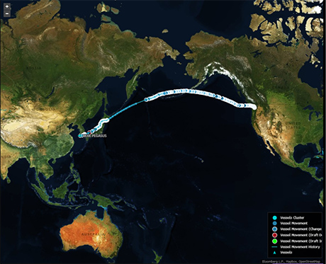
IMAGE: Peak Pegasus en route, via Bloomberg.
Fast forward a couple of months, and the Peak Pegasus was in Seattle, loading up with 70,000 tonnes of American soybeans. It left on June 8, headed to Dalian, in northeast China. China’s new 25 percent levy on the cargo was scheduled to take effect at noon on Friday, July 6; three weeks into its month-long journey, Peak Pegasus was scheduled to land with a few hours to spare—long enough, according to an anonymous source quoted by Bloomberg, to clear customs before the tariffs took effect.
As it neared China, Peak Pegasus accelerated—and also began trending on Chinese social media. According to Reuters, on Friday, July 6, the ship’s progress was the 34th-highest ranked topic on Weibo, with users wishing it luck. “You are no ordinary soybean!” cheered one user.
And then, tragedy. Peak Pegasus finally arrived in Dalian at 5.07 p.m. local time. On Weibo, Reuters reported, one user wondered whether letting the beans sprout might offer a loophole, another offered to take the soy on a romantic trip to Turkey instead. As of today, Peak Pegasus is still a few miles offshore, lying at anchor amidst a cluster of ships.

IMAGE: Peak Pegasus’s position on July 11, according to Marine Traffic.
In an interview with the Communist Party’s official newspaper, the People’s Daily, on Wednesday, Yu Xubo, the president of state grain trader COFCO, said that, going forward, China will feed its pigs with soybean imports from South America instead, as well as increased imports of rapeseed, sunflower seed, and fishmeal. Meanwhile, much of the 90 million acres of the American Midwest—an area almost the same size as California—that is currently planted with soybeans will likely switch to crops with lower profit margins, such as corn or wheat, instead. And, no doubt, the Peak Pegasus’s future voyages will look quite different.
(Thanks to Geoff Manaugh for the tip.)
The year I moved to New York, Sockerbit, a Scandinavian pick-and-mix sweet shop, opened in the West Village. I went once, and never again in the six years I lived in the city. The problem was not that I did not enjoy the fragrant, soft pink Smultronmatta (rippled squares of wild strawberry licorice) or the refreshingly tart Rabarberbitar (cylindrical rhubarb gummis with a lemon-flavoured filling); the problem was that I could not trust myself to exert any degree of self-control once across Sockerbit’s threshold.

IMAGE: Some of Sockerbit’s chewy delights, including Dansk Skalle, Rosa Kubik, Smultronmatta, Rabarberbitar, Super Sura Banana, Elefantskumfotter, and Rambo Twists.
As it turns out, this is a problem that the Swedish authorities, in all their benevolent wisdom, had anticipated. In her review of Bon Bon, a newly opened Swedish sweetshop on the Lower East side, Hannah Goldfield introduces the delightful concept of lördagsgodis, or Saturday Sweeties: a day of the week set aside for unbridled candy consumption, on the understanding that the other six will be gummi-free.
Speaking as my former self—a child who used to receive my pocket money on a Saturday morning, and hit the pick-and-mix aisle of Woolworth’s shortly thereafter—I can understand how this might work. Saturday Sweeties was the inadvertent outcome of the fact that I spent my money all at once and the sweets didn’t last much longer. But, Goldfield writes, in Sweden, this Saturday candyfest extends well into adulthood—indeed, it has been the official public health recommendation of the Swedish government since the 1950s.
The problem began in the 1900s, when sugar became affordable enough for manufactured candies to be mass-produced and widely available. By the 1930s, as sweet-makers introduced foam and jelly-textured offerings, the overwhelming majority of the Swedish population had cavities. Indeed, only one in a thousand military conscripts didn’t have tooth decay. In response, following the Second World War, the Swedish Parliament introduced a public dental service, but also commissioned a study, to be performed by the country’s only dental institute, in order to establish “what measures should be taken to decrease the frequency of the most common dental diseases in Sweden.”
At the time, scientists assumed that there was a link between diet and dental caries, but they were divided on whether tooth decay should be thought of holistically, as a symptom of deficiencies in overall nutrition, or locally, as the direct result of consuming sugar. It was quickly decided that the study should be carried out at the Vipeholm Institute, a state hospital “for individuals with mental handicaps,” situated just outside Lund. In an era before institutional review boards, the inability of the subjects to provide informed consent was, apparently, not an obstacle. The trial was also, controversially, supported in part by the country’s sugar industry and sweet and chocolate manufacturers.
During the first part of the study, dentists studied the impact of vitamin supplementation on dental caries, and found no effect. In the next phase, they administered sugar in both sticky and unsticky forms. At mealtimes, patients might receive either a sucrose drink “with only a light retention tendency,” or “new bread”—a sticky, sugar-fortified bun. In between meals, they were served up to 24 pieces of “Vipeholmstoffee”—”very popular caramels,” specially formulated to last longer and be stickier than normal toffee.
The results were striking. Consuming the caramels between meals was associated with a significantly increased occurrence of tooth decay. The Swedish authorities promptly launched a campaign to limit sweet-eating occasions, suggesting that children should save their candy to eat while listening to a popular radio programme on Saturday evenings. The accompanying public health message translates as: “All the candy you want, but only once a week.”

IMAGE: Chart from “The Vipeholm Dental Caries Study: Recollections and Reflections 50 Years Later,” Bo Krasse, Journal of Dental Research, 2001.
Today, Goldfield reports, Swedes eat more candy per year per capita than the citizens of any other country, at more than 30 pounds each—but the rate of dental caries among twelve-year-old Swedish children, is, according to World Health Organisation data, “very low.” Sweden does not fluoridate its tap water or salt, but its youth still have a lower rate of decayed, missing, or filled teeth than those, say, in the United States. Of course, whether lördagsgodis, the provision of public dental care, or some other factor is behind that improvement is still to be determined.
According to a 2001 paper by Bo Krasse, one of the dentists involved, the Vipeholm Study had other, potentially more important outcomes. “We as dentists did not see any ethical problems with the study itself,” he writes, noting that most of the symptoms were only “early enamel lesions,” which re-mineralised when the toffee was withdrawn. Meanwhile, over the course of the six-year-study, the hospital’s chief physician concluded that “both the general and the mental health of the patients improved markedly.” Still, in 1953, when the study’s results were published, the resulting outcry prompted the Swedish government to forbid the future use of Vipeholm patients as research subjects. The study is still cited in medical ethics debates today, although Krasse seems unrepentant. “My reflection now,” Krasse concludes, “is that the Vipeholm Study illustrates two well-known sayings: (1) The end sometimes justifies the means, and (2) it is easy to be wise after the event.”
