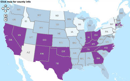
IMAGE: Fast food expenditure per capita, where the darkest (purple) areas spend between $500.01 and $707.75 a head, and the lightest areas (pale blue) spend between $320.64 and $400. All maps via the USDA Food Environment Atlas, except where otherwise noted.
IMAGE: Low income pre-school obesity rate, where the darkest areas represent the highest levels, between 20.1% and 39.7% obesity, while the lightest coloured areas show the lowest levels, from 2.1% to 5%.
On Tuesday, as part of Michelle Obama’s anti-childhood-obesity campaign, Let’s Move!, the United States Department of Agriculture (USDA) launched an exciting new tool: the Food Environment Atlas. Developed by the USDA’s Economic Research Service in partnership with the Centers for Disease Control, the National Cancer Institute, the National Farm-to-School Network, and the University of Illinois at Chicago, the atlas allows anyone with an internet connection to create custom maps of their food environment. What’s more, it even makes the data sets embedded in the atlas available for download.
The Atlas currently maps ninety food environment indicators, divided into three broad categories. “Food Choices” includes both measurements of food access and consumption, from the number of supermarkets per 1000 people to restaurant expenditures per capita. “Health and Well-Being” tracks dietary outcomes, such as hunger, diabetes, and obesity. “Community Characteristics” adds an extra level of demographic data, including income levels and metro/non-metro status.
The idea, then, is that researchers, policy-makers, and individuals can compare counties across America, comparing and analysing the correlation between food choice, health outcomes, and population characteristics.
So, what do you see when you look at America using food as the metric?
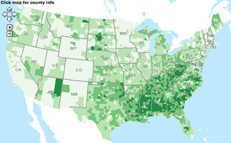
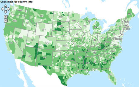
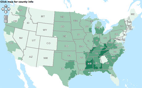
IMAGE: Adult diabetes rate: the darkest green represents areas where the rate of adult diabetes is between 12.1% and 17.4%; the lightest green areas have an adult diabetes rate between 3.2% and 8%.
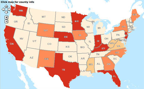
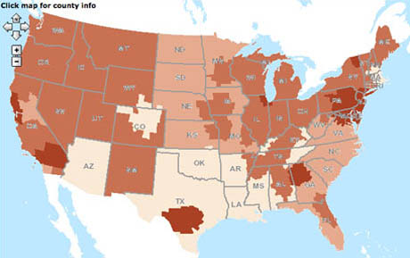
IMAGE: Sales tax on vended pretzels and crisps (chips), varying from a maximum (dark red) of between 5.01% and 7%, to no tax at all (light orange).
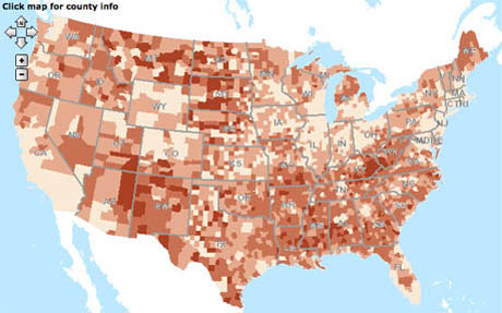
IMAGE: Poverty rate. In the darkest areas, between 25.1% and 54% of the population is below the poverty line, while in the lightest areas, the percentage is between 3.1% and 10%.
Each indicator generates a different map of America: by looking at them side by side we can begin to find food patterns and stories. Comparing these three maps (above) showing the incidence of adult diabetes, the percentage sales tax on vended crisps, and the poverty rate, for example, you can begin to make a compelling case that the relationship between diabetes and poverty is much closer than the relationship between high taxes on junk food and healthy adults.
IMAGE: Weight of fruit and vegetables eaten at home, per capita, ranging from 191 to 252lbs in the darkest areas to 143 to 160lbs in the lightest areas.
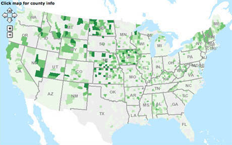
IMAGE: Number of farmer’s markets per 1,000 head of population, where the darkest green areas have 0.26 to 1.01 markets per 1,000 people, and the lightest areas have between 0 and 0.05 farmer’s markets per 1,000.
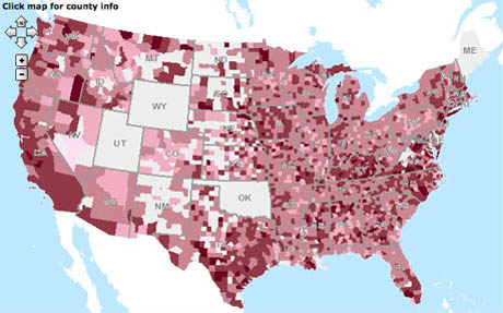
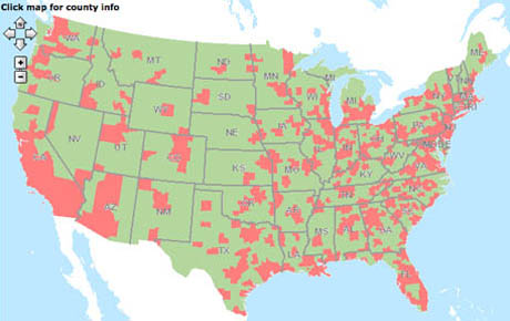
IMAGE: Metropolitan (pink) and non-metropolitan (green) counties of the United States.
Interestingly, while the number of farmer’s markets seems to correlate pretty well with non-urban areas, it has a much looser connection to the weight of fruit and vegetables consumed per capita. What’s going on there?
Of course, that question points to one of the limitations of this kind of spatial analysis: finding patterns and correlations is not the same thing as determining cause and effect. Still, knowing enough to ask the question is half the battle.
Another potential weakness is that the kinds of data you measure and plug in to the Atlas determine the questions you subsequently ask and – obviously – the conclusions you can draw. There are plenty of other factors that shape our food environments but are not (yet) factored into this Atlas, some of which are much harder to measure than others: food marketing spend, agricultural subsidies, environmental sustainability, global trade, industry consolidation, number of local food processors, first-generation immigrant population, the strength of regional food traditions and heritage, education levels, employment, health insurance, white-collar versus blue-collar jobs, civic engagement, and so on…
Some of the most intriguing recent findings on obesity show that social networks are an extremely strong force in shaping diet and health outcomes: imagine a Food Environment Atlas that could map Facebook connections onto gallons per capita consumption of soft drinks!
IMAGE: Gallons per capita consumption of soft drinks, ranging from 81 to 89 gallons a head in the darkest areas to 49 to 60 gallons in the lightest areas.
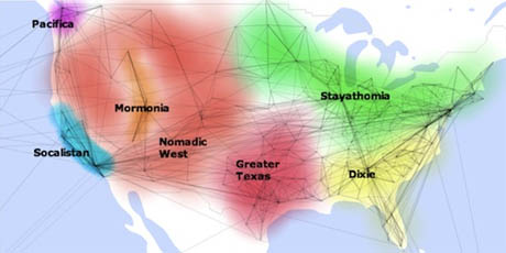
IMAGE: Connections between places that share Facebook friends, as visualised by former Apple engineer Peter Warden after analysing 210 million profiles, via. Intriguingly, for residents of the Nomadic West “Starbucks is almost always the top fan page.” What other links between Facebook profiles and food behaviours await discovery?
IMAGE: Video by Nicholas Christakis, based on his joint study, with J.H. Fowler, on “The Spread of Obesity in a Large Social Network Over 32 Years,” published in the New England Journal of Medicine in July 2007. For more on Christakis and Fowler’s findings, I recommend reading “Are Your Friends Making You Fat,” by Clive Thompson, published on September 10, 2009, in the New York Times.
Meanwhile, some food patterns simply benefit from a more nuanced analysis than the Food Environment Atlas is able to provide. Mapping cupcake bakeries as a marker of gentrification, or the relative spiciness of curries in neighbourhoods of first- and second-generation immigrants, for example, provides fascinating insights on a finer-grained, street-by-street basis than is possible in the county- and state-sized blocks of the USDA data sets.
Finally, the Atlas is glitchy and sort of ugly, and the advanced search function, which is supposed to enable queries that use multiple indicators, is extremely un-user-friendly.
IMAGE: Percentage of the total population in each county that is low income and lives more than one mile from a supermarket or large grocery store, where the lightest areas range from 0% to 15%, and the darkest areas from 40.1% to 79.5%.
Nonetheless, all of these weaknesses are far less important than the basic idea, which is that looking at landscapes through the lens of food can tell us all sorts of important things that we might otherwise miss. What’s more, re-perceiving a community in terms of food availability and behaviours is a pre-requisite to an even more exciting next step: actively designing for a healthy food environment. After all, if you begin measuring food access as an indicator of your community’s health and well-being, you might then enact zoning laws and introduce tax incentives to eliminate food deserts, for example.
So while the spatial analysis the Food Environment Atlas aims to offer is interesting, its potential to reframe food as a design tool, capable of reshaping the built environment and the economic landscape in the interests of both human and environmental health, could actually be revolutionary.
NOTE: If you find using food as a metric to look at neighbourhoods and cities interesting (probably a safe bet if you’ve made it this far), you might want to attend or podcast Sarah Rich‘s and my forthcoming event, Foodprint NYC: our second panel, “Culinary Cartography,” will discuss what kinds of things we might be able to learn from the varying food patterns of New York City.