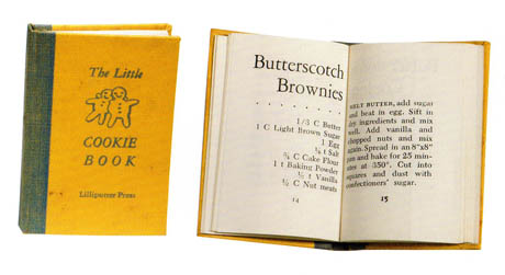
IMAGE: The Little Cookie Book, Ruth Adomeit (Woodstock, Vermont: The Lilliputter Press, 1960). 2 3/8 x 1 5/8″
On a recent excursion to The Morgan Library & Museum (to see their gorgeous William Blake exhibition), I spent some time in the gift shop leafing through a big book about miniature books. Based on a 2007 exhibition at New York’s Grolier Club, Miniature Books: 4,000 Years of Tiny Treasures contains such curiosities as “thumb bibles,” a truly tiny copy of Mao’s Little Red Book, and a two-by-three inch autobiography of Robert Hutchings Goddard, inventor of the liquid-propellant rocket, which accompanied astronauts on the Apollo 11 mission and thus became the first book on the moon.
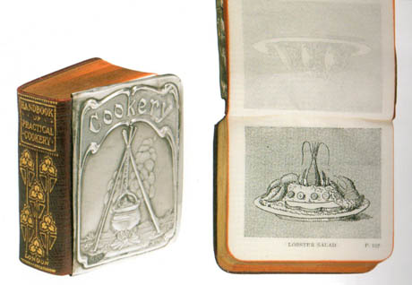
IMAGE: Handbook of Practical Cookery, Matilda Lees Dods (London: Eyre & Spottiswoode, 1906). 2 1/4 x 1 7/8″
The exhibition also included several miniature cookbooks, including – in spite of the format’s evident impracticality – a Handbook of Practical Cookery (London, 1906), dedicated to “the worldwide sisterhood of housewives and their husbands.” Its American contemporary, The Chunky Book, is a more tempting series of five volumes on “sandwiches, salads, chafing dishes, candies, and cocktails.”
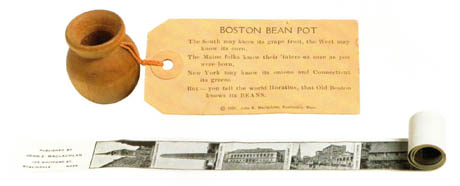
IMAGE: The Boston Bean Pot With Views (Roslindale, Massachusetts: John E. Maclachlan, 1929). The strip is 19″ long and 3/4″ high.
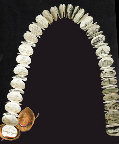
IMAGE: St. Louis Exposition in a Nutshell (Chicago: L. I.. Silverman, 1904). The strip measures 1 1/2″ by 1 1/8″ and was a memento of the 1904 World’s Fair.
Where food really seems to come into its own in the miniature book world is as a cover. Apparently, “presenting a souvenir panorama in a nutshell was a 1930s fad […] Clamshells were used for the same purpose, though with far less frequency.” Although it hardly seems to qualify as a book, the exhibition also included a miniature Boston bean pot from 1929, in which nestled a cylinder of city views. The attached postcard reads:
The South may know its grapefruit, the West may know its corn, the Maine folks know their ‘taters as sure as you were born. New York may know its onions and Connecticut its greens, but, you tell the world, Horatius, that Old Boston knows its BEANS.
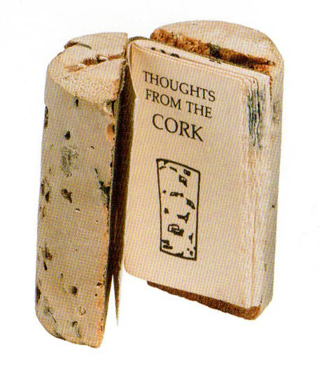
More recently, in 1981, a collection of witty sayings about “the pitfalls and pleasures of the grape,” entitled Thoughts From The Cork, was published, appropriately enough, inside the split halves of a wine cork.
IMAGE: Thoughts from the Cork (Salisbury, Connecticut: Lime Rock Press, 1981). The cork is 1 5/8 x 1″
On an equally whimsical note, this synopsis of a lecture given by Dirt Café and Slow Food member Claire Hartten at the annual St. Bride Printing Library conference diverted my attention to the Dutch phenomenon of edible letters. According to Fontshop, a Dutch typography firm, the tradition dates back to the middle ages, when apprentice monks were taught the alphabet using pastry letters, which they were allowed to eat as a reward after each lesson learned.
IMAGE: Still life with Letter Pastries, Peter Binoit, ca. 1615, via.
These days, edible letters are a seasonal treat in The Netherlands (and apparently also in Iowa). Rather than an orange at the toe of their stockings, St. Nicholas (known as Sinterklaas) brings good Dutch children their first initial, in chocolate form. Pastry and even sausage letters are also still available during Sinterklaas season.
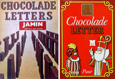
IMAGE: Dutch Chocolate Letter advertising (left) and packaging (right), via this treasure trove of Chocolate Letter images.
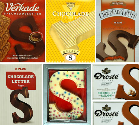
IMAGE: Many flavour variations on a chocolate letter S, but all in the Egyptienne font, via.
However, the would-be chocolate publisher faces some challenges in terms of letter availability and font choice. According to Fontshop, “most manufacturers don’t make the complete alphabet. Droste, for example, skips not only the I but also the U, X, Y and Z.” Meanwhile, numbers, exclamation points, and question marks are only available wholesale.
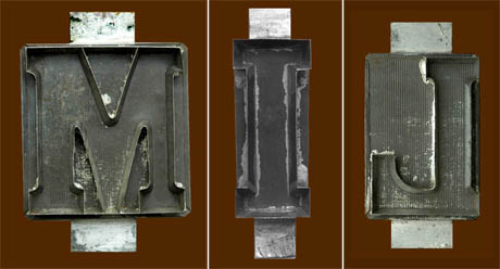
IMAGE: Chocolate letter moulds, via. The letter I is unpopular with manufacturers as all chocolate letters have to weigh the same – those who do produce it often package two Is together. The letter M is the most popular – it is the first initial of moeder (mother) and mama. According to Droste, “Every year we keep track of how the different letters do. For example, two years ago we had too many Gs, so last year we adapted the production accordingly.”
From a design point of view, the letters are most commonly cast in Egyptienne, a slab serif font designed by Frutiger in 1956 – roughly the same time as mass-produced chocolate letters first became available. Fontshop reports that although confectionary manufacturer Verkade experimented with digital LCD lettershapes a few years ago, they weren’t popular and the company quickly switched production back to the traditional Egyptienne, explaining that: “Because of its segmented shape the digital letter broke at specific spots. People prefer the traditional letter: somehow you always manage to break off a bigger piece than you intended.”
IMAGE: An advertisement for van Houten Chocolate Letters, via
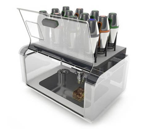
Finally, as if tiny cookery books and giant chocolate letters were not enough, we finish with the ultimate food publishing achievement: a 3D ink-jet printer that actually extrudes, combines, and cooks food. This is one of the design concepts proposed by two graduate students in MIT’s Fluid Interfaces Group, Marcelo Coelho and Amit Zoran, as part of their research project, Cornucopia: Digital Gastronomy. From their own description:
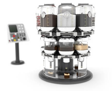
Cornucopia‘s cooking process starts with an array of food canisters, which refrigerate and store a user’s favourite ingredients. These are piped into a mixer and extruder head that can accurately deposit elaborate combinations of food. While the deposition takes place, the food is heated or cooled by Cornucopia‘s chamber or the heating and cooling tubes located on the printing head.
IMAGE: The Cornucopia Digital Fabricator, via Amit Zoran.
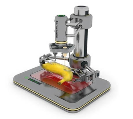
The Cornucopia Digital Fabricator is presented alongside a Virtuoso Mixer and a Robotic Chef, the latter of which boasts “an array of interchangeable manipulation devices, such as a drill bits, mineral and spices injection syringes, and a lower power laser diode,” and a mechanical arm that “can apply mechanical transformations, such as compressions, elongations, and torsion, as well as control the location of the food underneath the toolhead.”
IMAGE: The Cornucopia Virtuoso Mixer, via Amit Zoran.
IMAGE: The Cornucopia Robotic Chef, via Amit Zoran.
The culinary and design possibilities these tools would allow are mind-blowing: in the hands of Ferran Adrià, Heston Blumenthal, Marije Vogelzang, or James King, food could be transformed into something far beyond anything I am capable of imagining.
And if Cornucopia ever became a common household device, it would be the gastronomic equivalent of desktop computing or web 2.0: hundreds of thousands of people would suddenly have access to the tools to design their own new food forms and flavours, rather than being told what to eat by Kraft and how it should taste by Firmenech. Then there are the potential health benefits: the printer could control portion size, nutrient mix, and even pH balance.
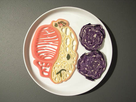
IMAGE: James King’s Dressing the Meat of Tomorrow, a project that examines how we can best design in-vitro meat and other artificial foods of the future in order to remind ourselves what they are and where they came from.
Sadly, Cornucopia is at the concept design rather than off-the-shelf gadget stage in its development. Nonetheless, it is inspiring to imagine that the food publishing of the future could also include dinner among its expansive library of possible formats.
Publishing Food is a very occasional series that collects intriguing examples from the overlap between food and publishing, broadly interpreted. For previous posts in the series, click here. Thanks to Geoff for the Cornucopia: Digital Gastronomy link.


6 Comments
I love these Dutch chocolate letters! They are so retro, I want to put old images of them on the wall of my apartment which I am decorating in a mid-century modern style!
Also, I love that 17th century painting by Peter Binoit with the baked letters. They so modern and anachronistic. I am fascinated by Dutch art from that time period, I mention it in my blog in places like http://www.rebeccapasternack.com/the-hague/ and http://www.rebeccapasternack.com/rijksmuseum-and-anne-frank-house/
Regarding the Cornucopia project at MIT, I have been in touch with the designer of that project and I suggested that he come speak at the Foodprint NYC event on Feb 27, http://foodprintproject.com/
I hope the Dutch Chocolate Letter company no longer uses offensive illustrations – https://www.ediblegeography.com/publishing-food-2/chocolate-letters-jamin-and-sinterklaas/ – in its advertisements.
One wonders if the Dutch, preconditioned as we are by this iconic chocolate letter font, get hungry or think of chocolate if they see the Egyptienne used in print.
BTW I did see smaller sized chocolate letters entering the market that use some sans serif font, but I have yet to look which one it could be. And the real fun are the Arabic versions available at some chain stores!
what type(s) of information would flourish in the auspices of this new language of embodied meaning?
I can just see it now – datadredging a lossless soufflé, reading its voids in light of its flavor, recalling the days of pharmaceutical companies before cutting boards turned into petri dishes when we used swallow water with a tasteless pill in its center. Listening to Savoy Truffle!
I would say: 3D ink-jet printer that actually extrudes, combines, and cooks “food”.
If you were to calculate total calories in/out in this type of production (transportation, production of all parts, etc) I think you would see less calories produced than used. Not sustainable any way you figure. Why waste our resources?
Great article and great pictures! Thank you for sharing!