If you, like me, were previously only familiar with pectin’s powers in the context of setting jams and jellies, this statement, from a recent article in Nature about the “secret language” spoken by plant cell walls, might stop you in your tracks:
Pectin is a complicated molecule constructed from at least a dozen sugars, connected by more than 20 types of linkage, says Wolf. “It’s actually so complex that we don’t know what it looks like,” he adds.
There’s something delightfully humbling about the realisation that a product found on almost any well-stocked supermarket shelf has a molecular structure that is sufficiently sophisticated as to be impenetrable to modern science. Truly, an everyday wonder!

(Unsurprisingly, given that we can’t be certain as to pectin’s exact chemical composition or its three-dimensional structure, we also can’t synthesise it, which means that all commercial pectin is still produced from fruit—specifically the peels and pomace of apples, oranges, lemons, and limes, according to the International Pectin Producers Association, and mostly in Brazil, Denmark, and Mexico, three countries you don’t often see appearing in the same list.)

“Interference with Pectin Methylesterification Causes Dramatic Growth Phenotypes in Arabidopsis thaliana” from this 2012 Wolf Lab paper.
Pectin’s manifold uncertainties extend to the intricacies of its functionality in plant cell walls, where it seems to play an essential role in plant shape and plant health. Just as it makes the difference between fruit soup and a satisfactory toast topping in the kitchen, reducing or amplifying its expression in plants results in “root-waving and convoluted stems,” raising the stakes for topiary enthusiasts everywhere…
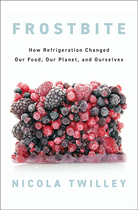
A long, long time ago, on this remote corner of the pre-Substack Internet, I began exploring what I dubbed the artificial cryosphere—the vast distributed winter of warehouses, juice tanks, reefers, meat lockers, and banana-ripening rooms that we’ve built for our food to live in. My refrigerated adventures led me to curate an exhibition at the Center for Land Use Interpretation, to teach classes at Columbia University on the subject, and to visit the world’s first frozen dumpling billionaire in Zhengzhou, for a New York Times Magazine story about China’s race to refrigerate its food supply. After a couple of years, I realized I actually had a book, rather than just an exhibition, class, or feature article, on my hands.
Frostbite: How Refrigeration Changed Our Food, Our Planet, and Ourselves is that book. It’s published on Tuesday, June 25, by Penguin Press. I am biased, but I think it’s pretty good. and several of the writers I most admire have already agreed. “It’s a fascinating, eye-opening journey, and Twilley is a fabulous guide. Frostbite will forever change the way you look at food,” according to Elizabeth Kolbert, and “a wonderfully addictive reading experience,” featuring “a remarkable cast of characters,” according to Deborah Blum. Bianca Bosker called it “a must-read for anyone who eats or drinks in the 21st century.” Harold McGee described it as “wonderfully, shiver-inducingly immersive”; Mary Roach called it “a perfectly executed cold fusion of science, history, and literary verve,” warning readers, “you have no idea the fun you’re in for here.” Yes, I am already blushing, but let’s just throw in a couple of nuggets from early reviews and interviews: writing in The Sunday Long Read, Alex Belth called Frostbite “a captivating new book … that should go on your summer reading list. Twilley is an irresistibly entertaining journalist—curious, smart, and funny,” and, on Atlas Obscura, Dylan Thuras said, “I cannot recommend this book highly enough. It is a page-turner. It is fascinating. And it changes the way you think about every single thing you eat. Go get it now!”
Writing a book is hard work, but I have to confess I also had a lot of fun along the way, visiting extraordinary spaces and meeting remarkable people. I worked in a refrigerated warehouse, I built a fridge, and I enjoyed an epic all-day banquet of never-refrigerated foods in rural China. I discovered things that shocked me even after spending more than a decade writing and reading about food—check out the stories behind the invention of salad bags and electrostimulation. And I realized that understanding refrigeration’s impact on what we eat, where it’s grown, what it tastes like, and how good it is for both our health and that of the planet isn’t just fascinating—it really matters. This invisible thermal technology upon which we are utterly dependent while also taking completely for granted has to change—humanity can’t continue to refrigerate our food the way we do now without dire climate change-induced consequences. But, unlike most climate change-related news, it’s not all doom and gloom—far from it. The story of refrigeration’s adoption also reveals how fast we can transform our entire food system, which, for the optimists among us, provides encouragement that we can do it again, and end up with something that’s not only more sustainable but also more delicious.
I’m beyond thrilled to finally be sharing these stories with you all, in the book, in the audiobook (which I narrated), in interviews, and at events round the country. Of course, on a journey that took me from subterranean cheese caves in Missouri to fishing boats on the shores of Lake Kivu, in Rwanda, I accumulated more stories than I could possibly squeeze between the covers of one book. I’ll be sharing many of them here over the coming weeks, so sign up below if you’d like to come along for the refrigerated ride.
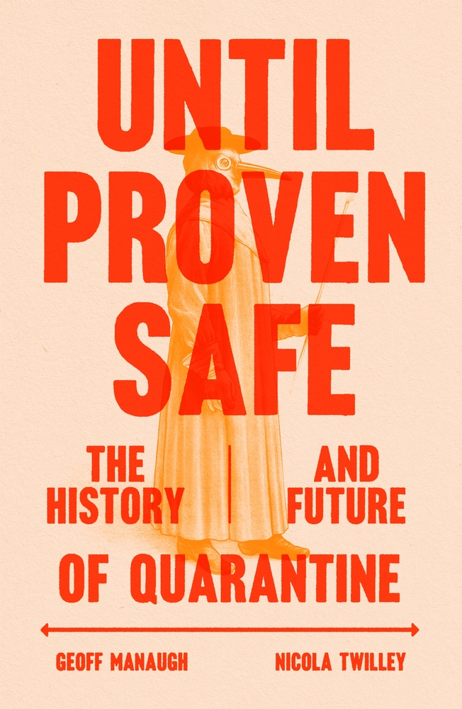
Behold! Edible Geography rises, vampire*-like, from the dead, for today marks the publication of my very first book! Until Proven Safe: The History and Future of Quarantine is co-authored with Geoff Manaugh, whom long-time readers of this blog will recognize as my husband and frequent collaborator, as well as the author of BLDGBLOG and, more recently, A Burglar’s Guide to the City, among many other books, articles, and stories.
This book has been a very long time in the making. A very, very long time, if you consider that I have dreamt of having my name on a book cover since I was a kid devouring Charles Dickens, George Eliot, Agatha Christie, and anything else I could get my hands on, Jilly Cooper and Erich von Däniken included, by torchlight under my duvet. Some of you may also recall that Geoff and I led a workshop and curated an exhibition called “Landscapes of Quarantine” at Storefront for Art & Architecture in NYC, back in the impossibly distant autumn of 2009. But that wasn’t enough to get quarantine out of our system, and we subsequently decided to write a book on the topic.
Today, finally, spurred on only slightly by the arrival of a global pandemic and its accompanying mass lockdowns, that book is out in the world, and available for purchase! Quarantine is, as we all now know, and as the host of our U.S. book launch event, Mary Roach, has astutely joked, extremely boring to live through—but it was utterly fascinating to spend a decade researching and writing about, and is, at least according to Mary, very enjoyable to read about too. Edible Geographers will probably want to dive straight into our chapter looking at quarantine across species: the social distancing practices of ants and termites, as well as the border checkpoints, maximum security greenhouses, and agricultural robots that keep our food supply safe.
You can hear me and Geoff discuss parts of that with my co-host, Cynthia Graber, on this episode of our podcast, Gastropod, and read an excerpt from that chapter of the book at Wired. There’s much more in the book besides: the behind-the-scenes story of how U.S. quarantine efforts went so wrong during COVID-19; not to mention an Ebola bubble, some nuclear waste, a boredom researcher, a four-star general, and Johnny Depp’s dogs…
One excerpt, in The Atlantic, introduces a group of obscure hobbyists who collect disinfected mail, and what their archives reveal about how quarantine has shaped borders, inspired the invention of the passport, and even led to the creation of the United Nations; another, in The Guardian, profiles the woman charged with protecting space from Earth life—and vice versa.
A seemingly simple concept—the temporary isolation of potentially dangerous life or matter, until it is proven safe—turns out to illuminate fundamental anxieties: about how to balance the risks of contact with outsiders with its rewards, for example, or how to navigate the bias and potential abuse inherent to a legal power of detention that is entirely based on suspicion. Quarantine offers the illusory attraction of drawing a line between inside and out—us and them—while highlighting the tension between individual liberty and public good, and even the eternal challenge of clear communication in a state of uncertainty.
All of which is to say, I am extremely proud of the book, and very happy to see it out in the world. Please pick up a copy, and join us at one of our book events in the coming weeks—if you’d like, with a Lazaretto** in hand! *Vampire myths, as it happens, have a connection to quarantine: one of the longest-standing quarantine lines in history, on the edges of the Austro-Hungarian empire, became ground-zero for vampire sightings in the late 1800s, triggering a literary mania that swept Europe. Read the book for more!
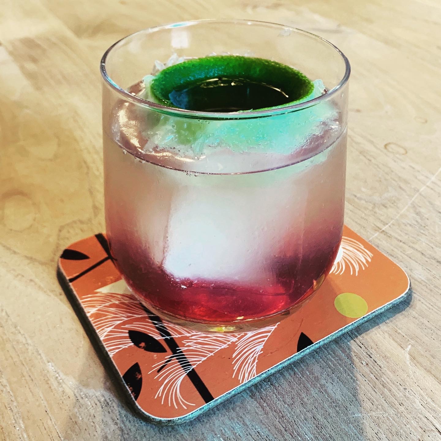
**The Lazaretto is a custom cocktail created specially for Until Proven Safe by master-mixologist Eben Klemm. It uses Wilder gin from Ventura Spirits: this is the beverage to which we turned after a hard day at the computer face while writing the book, and so we were delighted when they agreed to sponsor our book launch. Thank you, Ventura Spirits (and Rosecrans Baldwin, for the introduction)! And a huge thanks to Eben Klemm, for creating a drink whose resonances with quarantine work both conceptually and on the level of individual ingredients—but is still simple to make and utterly delicious! (Thanks also to Wayne Chambliss, for the introduction to Eben.) Grab some limes and make your own to sip while at our book events or while reading a copy of Until Proven Safe.
The Lazarretto
Combine:
• 2 ounces Wilder gin
• Juice of 1/2 lime (use fresh limes; see below)
• 1/2 ounce honey syrup (dilute 1 part honey to 1 part water)
You may build the above ingredients in a small ice-filled Collins glass or shake with ice first and then strain into an ice-filled Collins glass. (Or, honestly, whatever glassware you have)
Fill to 1/4 inch from top with good quality tonic water.
Turn lime half completely inside out and poke a hole in its navel with a skewer.
Place in drink, convex side down, and add 1/4 ounce cassis inside of the “lime-aretto.”
The lime-lazaretto is, like all quarantines, inevitably leaky. The blackcurrant is a fruit that was under federal quarantine for years—it acts as a host for a pathogen that wipes out pine forests (this quarantine is the reason that purple Skittles are grape-flavored in the US and blackcurrant everywhere else). The citrus and honey refer to the California border quarantine system, which protects the state’s unique ecosystem (as embodied in the native botanicals in the gin), as well as its agricultural economy. The tonic, of course, contains quinine, which is an anti-malarial!

IMAGE: Peak Pegasus. Photo by Jackie Pritchard, Marine Traffic.
Peak Pegasus is a bulk cargo ship, built in 2013, and, like so many commercial vessels, flagged in Liberia. At 229 metres long and 32.26 metres broad, she is Panamax-sized (the maximum width that can squeak through the canal is 32.31 metres), and she can carry a little more than 82,000 tons of whatever you need to move. For her owner, JP Morgan Global Maritime, that has most recently meant commodity crops such as sorghum and soybeans. And that, thanks to the imbecile currently installed in the White House, has made her last couple of voyages more interesting than usual.
For those who have switched off the news in despair, a quick update: the United States recently imposed tariffs on $34 billion worth of Chinese goods; the Chinese responded by levying an equal amount on American imports; and, just today, the White House has threatened to tax an additional $200 billion of Chinese tilapia, handbags, and chemicals.
The majority of farmers across the American Midwest voted for the current President. They also export more than half their soybean harvest to China, as livestock feed. In Kansas, Texas, Colorado, and Oklahoma, farmers also grow tens of thousands of acres of sorghum, specifically for export to China, where it is fed to pigs and distilled into baiju. What could possibly go wrong?
This is where the recent adventures of Peak Pegasus are instructive. According to Reuters, back in April, the Peak Pegasus took on 58,503 tonnes of sorghum from an Archer Daniels Midland grain elevator in Corpus Christi, Texas, and set off for Guangzhou, in southern China. En route, officials in Beijing announced that they were launching an anti-dumping probe into U.S. sorghum exports, in retaliation for new U.S. tariffs on imported Chinese washing machines and solar panels.
Peak Pegasus changed direction, heading instead for South Korea. It was, Reuters reported, one of twelve cargo ships full of sorghum headed to China, whose importers, faced with losses of millions of dollars, were frantically trying to resell the grain elsewhere. “Four cargoes have been resold to Saudi Arabia and Japan, and another is heading to Spain,” Reuters continued, but at “steep discounts.”
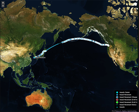
IMAGE: Peak Pegasus en route, via Bloomberg.
Fast forward a couple of months, and the Peak Pegasus was in Seattle, loading up with 70,000 tonnes of American soybeans. It left on June 8, headed to Dalian, in northeast China. China’s new 25 percent levy on the cargo was scheduled to take effect at noon on Friday, July 6; three weeks into its month-long journey, Peak Pegasus was scheduled to land with a few hours to spare—long enough, according to an anonymous source quoted by Bloomberg, to clear customs before the tariffs took effect.
As it neared China, Peak Pegasus accelerated—and also began trending on Chinese social media. According to Reuters, on Friday, July 6, the ship’s progress was the 34th-highest ranked topic on Weibo, with users wishing it luck. “You are no ordinary soybean!” cheered one user.
And then, tragedy. Peak Pegasus finally arrived in Dalian at 5.07 p.m. local time. On Weibo, Reuters reported, one user wondered whether letting the beans sprout might offer a loophole, another offered to take the soy on a romantic trip to Turkey instead. As of today, Peak Pegasus is still a few miles offshore, lying at anchor amidst a cluster of ships.
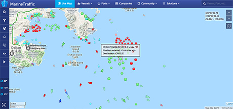
IMAGE: Peak Pegasus’s position on July 11, according to Marine Traffic.
In an interview with the Communist Party’s official newspaper, the People’s Daily, on Wednesday, Yu Xubo, the president of state grain trader COFCO, said that, going forward, China will feed its pigs with soybean imports from South America instead, as well as increased imports of rapeseed, sunflower seed, and fishmeal. Meanwhile, much of the 90 million acres of the American Midwest—an area almost the same size as California—that is currently planted with soybeans will likely switch to crops with lower profit margins, such as corn or wheat, instead. And, no doubt, the Peak Pegasus’s future voyages will look quite different.
(Thanks to Geoff Manaugh for the tip.)