What do you see when you map the world through food?
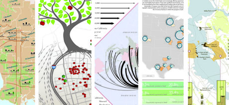
IMAGE: Strips from five of the seventy-plus maps in Food: An Atlas.
According to Food: An Atlas, a crowd-sourced, crowd-funded, “guerrilla cartography” project led by UC Berkeley professor Darin Jensen, you see the distribution patterns of the global almond trade but also the lost agrarian landscapes of Los Angeles, the geography of taco trucks of East Oakland and the United States beershed, as well as the rise of foodbanks in the UK, and much more besides.
Over the past five months, Jensen has pulled together more than seventy maps, more than one hundred volunteers, and now more than three hundred supporters in order to assemble this kaleidoscopic introduction to both the cartographic context of food and the stories maps can tell.
With only six days remaining to support the publication of the Atlas through Kickstarter, and more than $6000 left to raise, I spoke to Jensen to find out how the Atlas came about, what it includes, and why it matters. You can read our conversation below, and reserve your advance copy to support the project here.
•••

IMAGE: Strip from a map of Urban Agriculture Projects in San Francisco, from Food: An Atlas.
Edible Geography: I first came across your work a year and a half ago, when I wrote about a map that showed both gang territories and cupcake bakeries in the Mission district of San Francisco. It was created by a student of yours as part of a class assignment that also showed historic and future waterways, sounds, and speciality dog services. How does this new project relate to that earlier exercise in hyper-local cartography?
Darin Jensen: Mission Possible: A Neighborhood Atlas was a project of experiential learning. Each of my students chose their own subject matter and mapped it at the neighbourhood scale, and then I worked with them to put all the maps together into an atlas.
What that project did was make me realise that I could get people organised around making an atlas. I’ve always been interested in making atlases but, as a cartographer and as a university lecturer, I don’t have time to make twenty or forty or one hundred maps, all on one subject. Even if I did, by the time I finished it, all the data would be starting to get stale and old.
That’s why I call this atlas “a project of guerrilla cartography and publishing.” I wanted to make atlases; they take too long to make, so this is an experiment in doing it faster. We can get the cartography done through crowd-sourcing, and now we’re working on getting the publishing done that way too. It doesn’t have to take two or three years to put out a book or an atlas.
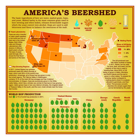
IMAGE: America’s Beershed (or where US breweries source their ingredients), as mapped in Food: An Atlas.
Edible Geography: Who have you worked with to crowd-source the content, and how long has the project taken?
Jensen: I wrote the call for maps in June of this year. There’s an organisation called NACIS (the North American Cartographic Information Society), and they have a list of university cartography and GIS labs in North America, so I sent it to that list. I also found a list of food policy networks and professionals in the United States. I ended up sending the call to about 250 email addresses and from there it’s gotten around on blogs and social media. I didn’t want it to go to just anybody, because I wanted submissions from people who either had a background in cartographic and GIS analysis or were involved in food studies and food policy.
We’ve now got a hundred people working on the atlas, between the cartographers, the researchers, the editorial panel, and so on. I crowd-sourced vetting the maps as well — I brought in a professor of education, a professor of GIS, a journalist, a data visualisation expert, and an author to help look at the maps, to analyse them, and to edit them. Right now, we’re in the second round of editing and I’m starting to get a flood of maps coming back. Some people have adjusted their cartographic analysis and some needed a little graphic help.
This project has ended up really being about creating this community. I’m dealing with people everyday from all over the world that I’ve never met, and we’re all working together.
And it was one thing to get the maps and vet them, but then I needed a graphic designer to do a cover and the inside matter. I had to have a production person who would contact all these cartographers and get the details for the notes and attributions in the back of the atlas. We want this to be good, scholarly work, so, for each map, we’re making sure we know where the data comes from, what projection they’re using, and so on. Then I had to find a guy who liked our project enough to make a video for the Kickstarter campaign. All of these people have done all of this work and they’re not getting any financial benefit. The only money we’ve spent is $100 that I used to buy paper to print proofs.
This all started in June, as I said, and we plan on sending it to the printer on November 15.
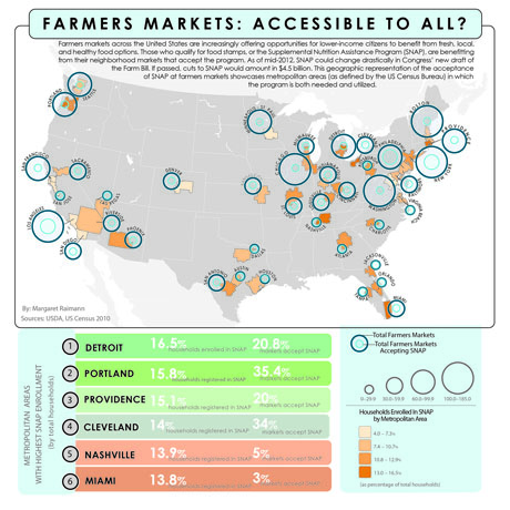
IMAGE: Farmers’ Market Accessibility, as mapped in Food: An Atlas.
Edible Geography: How many submissions did you receive in the end, and who did they come from?
Jensen: For the first deadline, we got about eighty maps, and a few more than sixty were viable. There were some that were just not going to work because of the subject matter or because the cartography was so bad that we could tell that there was no hope. But we’re inching up towards seventy plus again because, as part of the Kickstarter campaign, we invite people to send us formatted maps, and we’ve had a number of really interesting ones come in.
I think we’re going to have about seventy maps, in the end. And that doesn’t include the kids’ section, which is going to be fantastic. There’s a group in the UK called the Geography Collective and they just came out this summer with Mission: Explore Food. It’s all about the geography of food for kids. So we invited them to put together a six or seven-page section of excerpts from their book, which will be really fun.
Most of the maps came from individuals affiliated with universities. A quick scan of email addresses reveals the University of Texas, the University of Delaware, the University of Kentucky, Sheffield University, Dundee, Salem State, Rutgers, Johns Hopkins, UC Berkeley, UC Davis, Columbia, NYU… Then there are a few maps from organisations like Green Map System, Ecotrust, and iconoclasistas, as well as maps from independent scholars like Sandor Katz and Bill Rankin.
I believe most of the maps were produced for the atlas because we mostly received map proposals, rather than actual maps, with the first round.
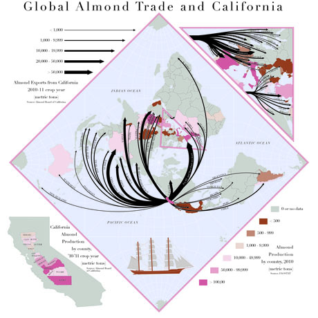
IMAGE: The Global Almond Trade, as mapped in Food: An Atlas.
Edible Geography: Did you have in mind, editorially, an ideal selection of maps, or did you go into this thinking the content would be dictated purely by what came in and what was good enough?
Jensen: The latter. We just wanted to see where it would go when we asked people to send us maps on food. The call suggests some ideas, but more as a way to let people know that they could do whatever they wanted. This is what we said:
Any and all subject matter related to food is welcome, from urban food security to rural food industrialization, foodstuff distribution to cuisine diaspora, foraging for food to being paid not to grow it. We endeavor to map food in its varying contexts and conditions and at all scales of research and geography.
We didn’t actually get anybody making a foraging map. But what has happened, in working with the editorial panel that I put together, is that we printed all the maps in draft form and we taped them up on my white board and we started organising them by theme, and so it turns out that there’s going to be a chapter on food production and other ones on distribution, food security, and cuisine.
Within each chapter, they’re organised by scale. For example, the production chapter will start with world-scale maps, which show things like the amount of land given over to crops in the world, and it moves from there to the continental, regional, and then to the hyper-local scale.
In the distribution chapter, there’s a map of the world almond trade as a flow chart. A vast majority of the world’s almonds happen to grow in California and this map shows how they are moved around the world. Editorially, what’s interesting is that we can’t afford to have a map of the distribution of every single commodity in the world, but we can use a map of almond distribution to show what commodity distribution is like in general terms.
As another example, there’s a map of the rise of food banks in the UK, and that tells us something about the rise of food banks as a proxy for anywhere in the world. It doesn’t mean these processes happens the same way in Brazil or India, but, overall, we’ve got this smattering of subjects related to different areas around the world and there is a narrative that the Atlas reader can carry through.
The Atlas is going to absolutely provoke more questions than it provides answers, but that’s fantastic, because that’s what we should be doing as scholars: getting people to think about these kinds of issues.
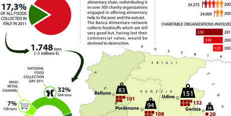
IMAGE: Strip from a map of Collecting Food Surplus in North-East Italy, from Food: An Atlas.
Edible Geography: In some ways, then, is it less of an atlas of food and more of a guidebook to the kinds of cartographic questions you can ask about food, so that people are inspired to go out and map their own food issue or foodscape?
Jensen: Yes, exactly. It’s called Food: An Atlas, and on the last page we are going to invite people to help us create Food: The Atlas. Let’s get 600 maps, and I’ll work on that for two or three years, because that’s what it will take! In some ways, these particular food maps are just the vehicle for this experiment in guerrilla publishing.
Edible Geography: Why did you choose to map food?
Jensen: I hate this expression, but maps are sexy, food is sexy, and so together it’s just a cool thing that people want to know about and see. We’ve had people say, what’s the next one going to be about? Is it going to be energy? Is it going to be transportation? We’ll probably do something like that at some point. But for me, food is a big deal. I grow food, I’m on the board of an urban agriculture nonprofit here in the Bay Area, and I do a certain amount of activism around food justice, so it’s just something I’m passionate about.
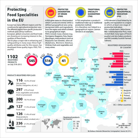
IMAGE: Protecting Food Specialities in the EU, as mapped in Food: An Atlas.
Edible Geography: Given that you are someone who knows and thinks about food issues, were there any surprises in the maps for you?
Jensen: That UK foodbank map that I mentioned shows that the UK hardly had a foodbank system ten or twelve years ago, which was a huge surprise to me. It was a shock to me that it’s so difficult to get GIS data for India — I didn’t know that. We do have a map of India in the Atlas and the data is ten years old. I was concerned about that, but it’s because that’s the latest data that the government has supplied. I could probably come up with a surprising thing about each map if we went through them — there were lots of surprises!
Edible Geography: Do some of the maps also speak to each other in interesting or surprising ways?
Jensen: Yes, I think that they do. There’s a map of the food networks of Canada which shows all the different agencies working in Canada for food security and food justice, and then there’s also a map that shows food insecurity among the indigenous people of Nunavut. You can read those maps back and forth and they definitely inform each other.
This reminds me of something that we built into the Mission Possible atlas, which we won’t be able to do here. Because it was only twenty or so maps, we bound it with notepad glue, so that it would come apart and you would end up with the maps in a different order every time you looked at it.
The narrative of an atlas that’s bound is that this page follows that page. Every time you look at the Mission Possible atlas, you read it in a new order, and so it’s a different narrative. We won’t be able to do that with this project, because it’s too big, but still, the maps should absolutely inform each other.

IMAGE: Strip from a map of Global Crop Distribution, from Food: An Atlas.
Edible Geography: There’s something really interesting about having so many maps by different authors next to each other, so that you really can see their individual aesthetic decisions and stylistic choices and the influence those then have on their maps, which are a form that’s otherwise easy to regard as uninflected, purely factual information.
Jensen: I think this is a first of its kind, on a lot of different levels. I’ve never heard of an atlas that was crowd-sourced and I’ve never heard of an atlas that didn’t have a single, unified aesthetic.
It is kind of like an art book in that sense, in that on each page, the cartographers’ own aesthetic will come across. It would have been impossible to impose a colour palette, for example. Some people needed some help letting their aesthetic bloom, and that’s something we’ve worked on in the editing process. In the end, though, some of the final maps won’t be that fantastic-looking, because the person could only take it so far, and I’m not going to impose my aesthetic on them.
I’m not going to go into my tirade about GIS and why it’s not great for cartography that map-making is so easy now, but I will just say that so many people let the software default rule the map. There’s a colour palette suggested and they’ll just accept it. There’s label placement suggested and they’ll just accept it. You have to get your hands into it and manipulate the graphic. When I teach cartography, the first thing I say to my students on their very first day is “Welcome to art class.” I teach cartography as a graphic art — as a way of communicating through graphics.
Edible Geography: What are the particular strengths of mapping as a tool to communicate about food, or about anything else, for that matter?
Jensen: In general terms, a map is such a fantastic communication device because you can get so much more information on one page than you could ever do with text. Take any map: there will be scores, if not hundreds, of pages of textual information embedded in that single graphic. If you pick any map and you start to write about what you see in it and what you can learn from it, you can just go on and on and on. But in the map, that’s all distilled into this graphic.
I also love maps for the fact that they all have a narrative, but you’re invited, as the map reader, to step into the narrative wherever you please. A book starts with a page, with a paragraph, with a sentence — with a word. There’s always a first word. With a map, the map reader steps into the narrative wherever they’re most drawn to. It might be the title, it might be the key, or they might dive in anywhere in the graphic. It’s just a much more independent learning mode, I think.
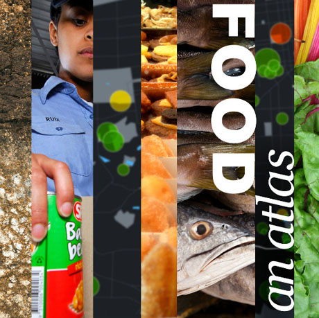
IMAGE: The front cover of Food: An Atlas.
Edible Geography: Where does this guerrilla publishing experiment fit in the history of cartography? Is crowd-sourcing the future of cartography?
Jensen: I hope it’s seen as an interesting and memorable experiment. I think that it’s absolutely not going to be the way that atlases are always made from now on, but I hope that it inspires people and that it shows people that we can assemble a diversity of analysis and ideas to give us a holistic picture of an issue.
I’m known on this campus as being vehemently anti-textbook. It’s because I don’t believe that one author or one publisher can tell you everything there is to know about any subject. Instead, I make a reader for my courses that will have a chapter from one textbook and another from a different textbook and then a variety of articles from magazines and journals.
This atlas is kind of like that in a way. There are other food atlases out there, but they all have a singular perspective. The USDA has a food atlas, for example — but it also has an organisational mission, and it has its own biases, and so on. Their food atlas is a food atlas according to the USDA. This is a food atlas according to all these people who care enough about food and maps to follow it on this journey.
